Offline but never limited: optimize your app with offline mode
Imagine a revolutionary mobile app, a kind of digital genie that makes your wildest desires come true: it makes your morning coffee, plans your day, keeps you connected with your loved ones, runs your errands, and even – why not – it could go to work for you when fatigue gets too much to bear! After several months of use, it has become your indispensable digital companion.
However, one day, without warning, your Internet connection abandons you, the wifi goes on strike and you find yourself stuck with the most chaotic EDGE network. The coffee machine refuses to obey, your diary gets lost in the meanders of cyberspace, conversations with your loved ones have disappeared and your groceries are no longer automatically ordered. A blank screen appears, followed by endless loading… in short, the application stops responding… Everything seems to collapse at that very moment. An application so wonderful, so vital, suddenly becomes unusable because of a simple Internet outage?
Let’s find out how this supposedly “brilliant” application can really become so, even when the Internet connection fails.
User experience at the heart of applications
When creating a mobile application, everything revolves around the user experience. It’s what guides every step of the design process. The above example is extreme, but it provides a striking illustration of the consequences of a network failure. However, more concrete situations can also highlight the crucial importance of offline mode.
Let’s imagine an application where employees have to swipe a QR Code to start missions at specific locations. If these QR Codes are placed in unstable network zones, such as dead zones or buildings with poor reception, the user will be faced with the frustration of seeing the application, vaunted by their superiors, malfunction.
Unstable Internet connections are not limited to isolated situations. They can be caused by a variety of factors, such as limited connections (in hotels or abroad), power failures, extreme weather conditions, or even poor coverage on the part of the service provider.
When we set out to create a mobile application, the consideration of lost or poor connection quality must be at the heart of every feature we develop. This ensures an optimal application experience, even when connectivity conditions are difficult.
Offline mode, you say?
Implementing offline mode in a mobile application enables it to continue to function and offer certain features, even when the device has little or no access to the Internet. However, ensuring continuous use of the application is no magic trick. Some functions cannot function without an Internet connection, but there are various ways of dealing with loss of connection, as illustrated below.
For example, real-time messaging requires an active connection to function fully. If you’re interested in this subject, we have an article here: Real-time web, when every second counts! However, even in these cases, alternative solutions can be envisaged to enhance the user experience despite the absence of a connection.
How can offline mode concretely improve the user experience?
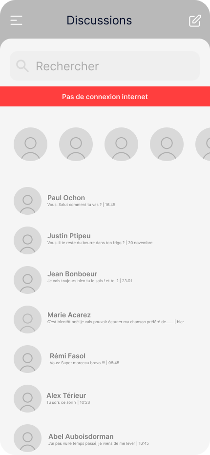
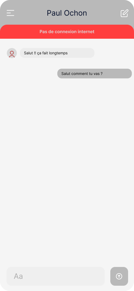
Let’s take a basic instant messaging application as an example. In this application, the first screen shows the list of conversations (1), and as soon as you select one of them, the whole conversation is displayed (2).
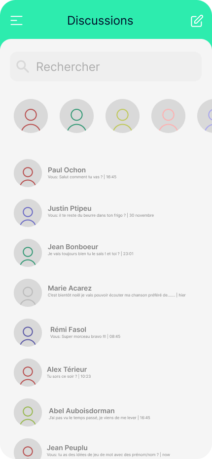
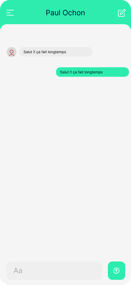
If we hadn’t taken future users into account, we would have assumed that everything worked perfectly: the first screen would simply have sent a request via the Internet network to retrieve my conversations. Once the response was received, it would have been displayed in the application and that would have been that. However, the problem arises if, for one of the reasons mentioned above, the network disappears. In this situation, the application would continue to load indefinitely, until a less-than-explicit “Network error” message appeared…
Let’s take a look at how offline mode can enhance the user experience in this specific context:
Visual notification
The first step is to inform the user that their experience is altered and why. This avoids the frustrations of using an application in conditions where it cannot function to its full potential. Many applications cannot be used to their full potential offline. This is the case with YouTube, which blocks video playback, or Messenger, which displays a banner at the top of the application to indicate the absence of a connection. However, no one has the impression that the application is “buggy”.
As far as our messaging application is concerned, let’s focus on the first interface: conversations are stored in a database, but I can’t access this database without an Internet connection. So I might consider displaying a clear and precise error, YouTube-style, explicitly describing the problem encountered:
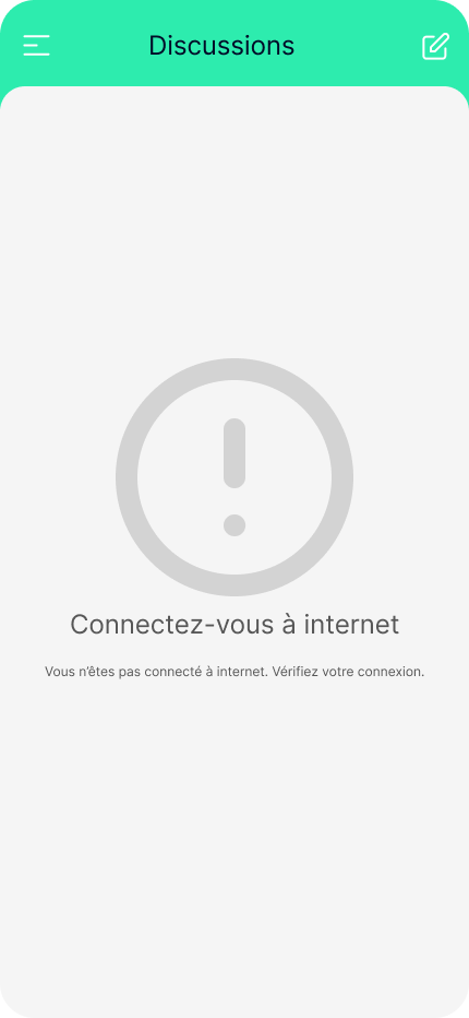
It’s crucial to use appropriate, simple and understandable terms, without resorting to technical language, to ensure a clear, direct and precise explanation.
Don’t block the user
In the context of our application, the previous notification completely blocks access to discussions (without affecting the rest of the application). However, a better approach would be to offer a less intrusive and aggressive notification, while giving the user the option of accessing a few extra features such as being able to view conversations.
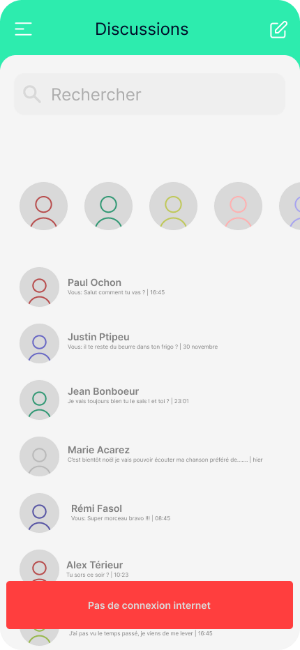
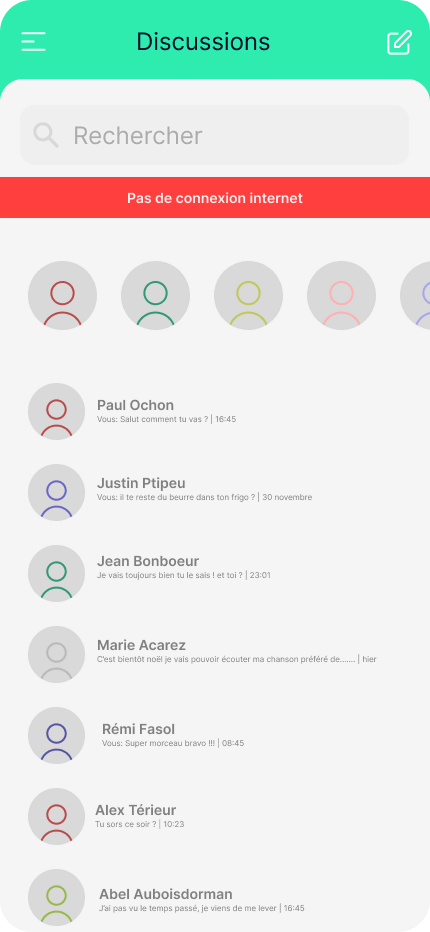
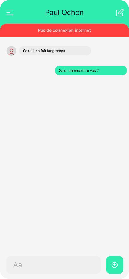
In the case of an unstable connection, it’s better to use an impactful but non-intrusive visual notification when network connectivity fluctuates, rather than a strobe effect between the loaded screen and the error screen.
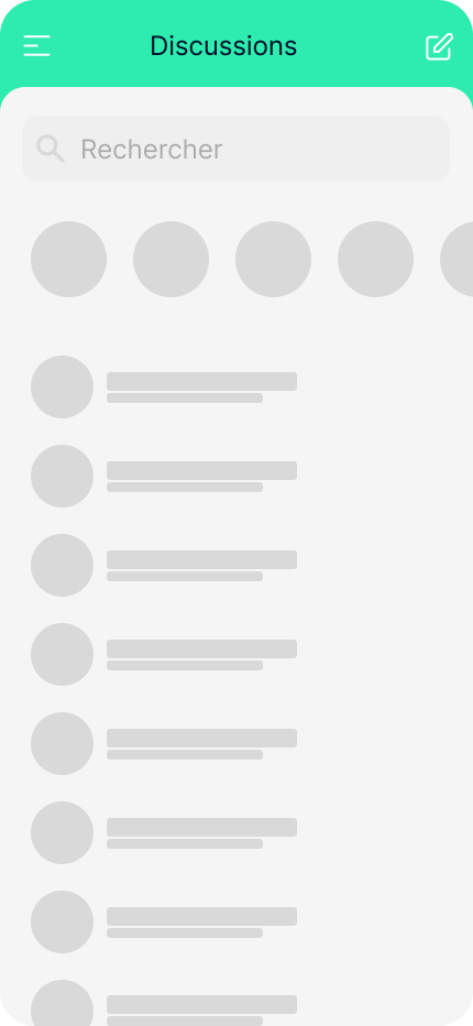
What’s more, when loading data, it’s best to avoid full-screen loading, which immobilizes the user. Instead, “skeleton loader screens” are preferred, representing spaces (often animated) reserved for the information being loaded. A skeleton screen mimics the structure and appearance of the full view, providing a visual overview of the content waiting to be loaded in each block, be it image, text or any other type of information.

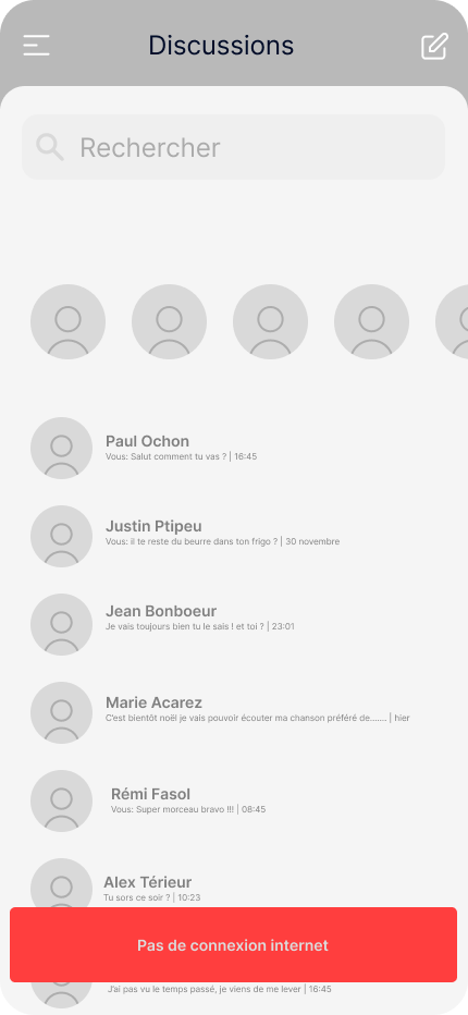
It’s always possible to offer an original way of notifying the user that the application is going offline, by offering a new visual to the application. For example, switch the application to black and white:
Storage
To solve the above problem, one solution would be to store the last 10 messages of the last 10 conversations locally on the phone. This way, even in the event of a weak or non-existent connection, the user would not be blocked.
Storage is an effective solution for improving the user experience when a connection is lost. In our application, it would enable users to see the latest messages in a conversation, such as the address of the restaurant where they have an appointment, even if the network has dropped them.
This approach ensures continuous, convenient use of the application, despite any connectivity disruptions.
Delayed submission
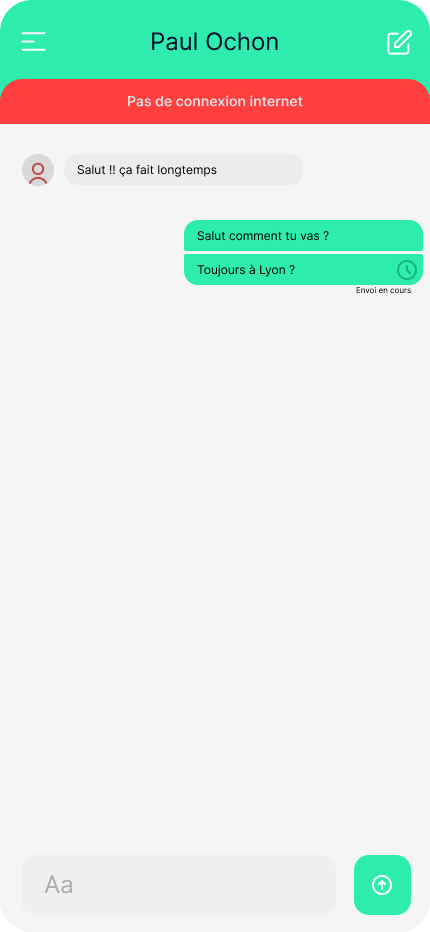
Another way of enhancing the user experience is to offer the possibility of writing and sending a message even when there is no connection. The user can access a conversation, write a message and send it. A clear visual notification will indicate that this message will be transmitted as soon as the network is restored. This feature guarantees uninterrupted use of the application, even when the connection is unstable.
That’s it?
Of course not! In fact, there are many ways to considerably improve a mobile application, even when the network connection is less than optimal. We’ve explored the main elements to be taken into account when designing a quality application, based on a simple example. However, solutions are varied and innovation continues to discover advanced techniques to further enrich the user experience.
Keeping things simple and understanding what the user will and won’t use is the most important thing. We could take the example of more complex applications such as Google Docs, where it is possible to collaborate on a document offline, and where the logic for merging versions has been made as simple as possible. As this is one of the least frequent use cases, Google’s teams have opted for a “simple” solution, which is to merge all the text modified by the authors, at the risk of the text becoming incomprehensible. All that’s then needed is to reword the whole thing. This avoids loss of content, simplifies the source code and its comprehension, and optimizes development time to respond to real user problems.
The possibilities are vast, but every innovation requires a high level of technical expertise and knowledge of user needs. At TheCodingMachine, we like to meet these challenges with passion and expertise!
What can we conclude?
The offline mode represents a technical challenge with its own small challenges if you want to innovate. However, it’s not difficult to produce a quality application that meets the requirements of today’s mobile application consumers, as long as they are placed at the heart of the design.
Author: Jérémy Dollé
Publié le 4 June 2024


